Boba Mood
Case Study
October 2021 - December 2021
Personal Project
User Research
UI Design
User Testing
Prototyping
Whimsical, Figma
Background:
Bubble Tea (aka Boba) is a popular Taiwanese beverage enjoyed by many, consisting of a flavored tea (milk or clear), as well as a “topping”, or a chewable snack that comes with the drink (Tapioca pearls, Grass jelly, etc).
Problem:
When buying bubble tea, consumers take some time to make a decision to decide what they want to drink, especially when they are faced with a paradox of choice. Sometimes they crave a certain brand but do not have access to it, or want to try a new flavor but do not want to take the risk and be disappointed.
Research:
There are more than 50 bubble tea stores in the Metro Vancouver area, making it very accessible to people who want bubble tea at any time. This includes local franchises and global chains, which creates a competitive market for bubble tea. The goal of this application is to connect avid bubble tea consumers to local or a variety of stores, and allow them to have a better experience to trying new flavors.
Is there a way for bubble tea consumers connect with new drinks or remember precise customizations?
Constraints:
Users using the application are familiar with bubble tea.
Users of the application are mainly consumers, not the sellers.
Assumptions:
A few assumptions I had to make were:
- That all bubble tea stores have:
- standard drink bases (milk, milk tea, clear tea, etc.)
- adjustable sugar and ice levels with similar proportions
- The preference system I mocked in the design is an established system
(Mini) Heuristic Competitive Analysis:
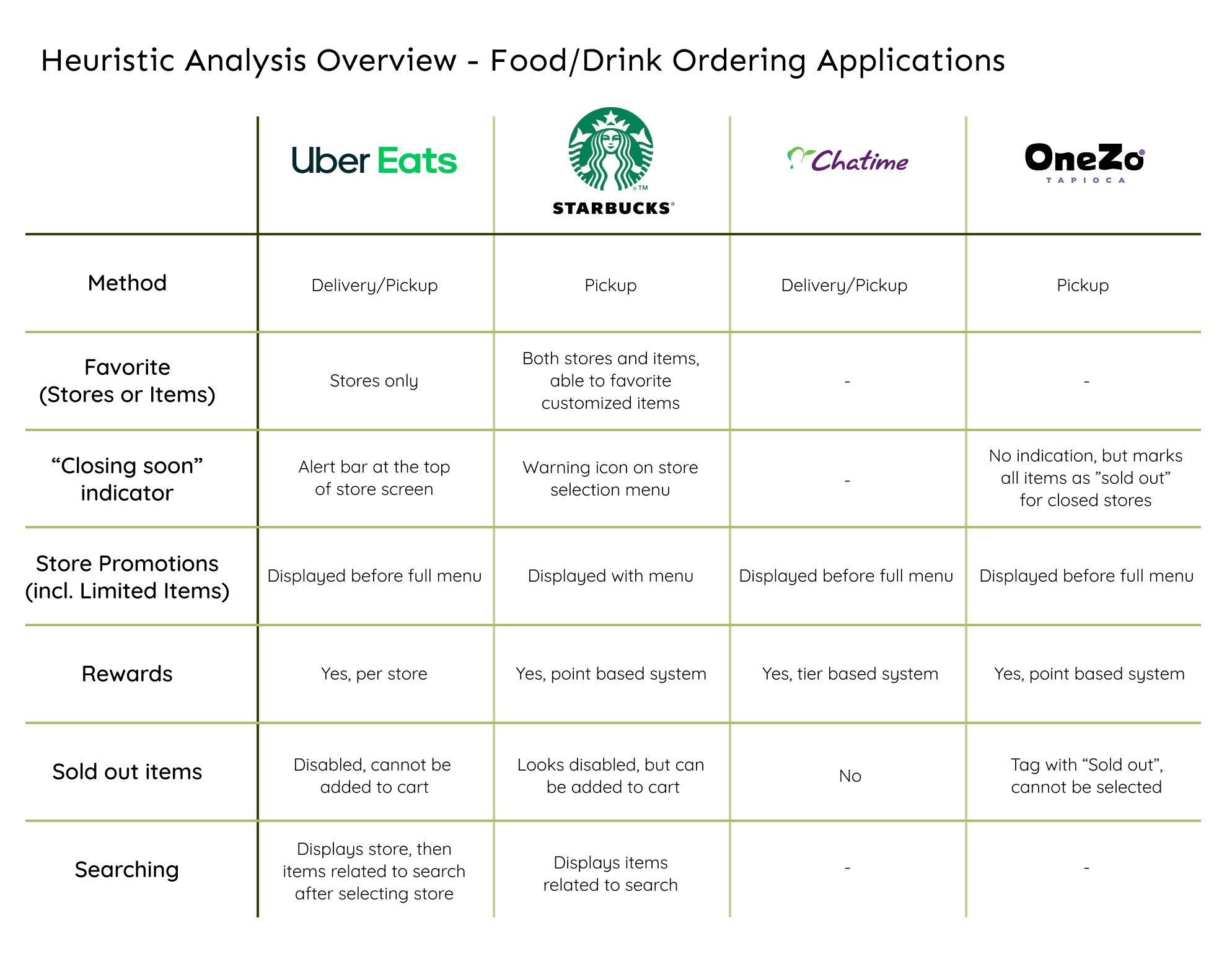
As this was not a new idea, I looked at other food/drink ordering applications: UberEats, Starbucks, Chatime Societea and OneZo Tapioca, to learn if they already had features I had in mind, or other features that I might need.
Interviews:
I interviewed 11 participants between the ages of 20 to 24 on their bubble tea drinking and ordering habits, as well as how they feel about food ordering applications.
These questions are:
- Familiarity with bubble tea
- How many bubble tea franchises are you familiar with (local/global)?
- How often do you have a variety of bubble tea brands (local/global)?
- How often they have a variety of drink types (Fruit, Milk, etc.)
- Ordering bubble tea
- How long do you decide what to drink?
- How long do they take to make that decision?
- How do you decide what store to go to?
- How do you order? / What is your ordering process?
- Do you adjust sugar and ice levels? Any other modifications?
- Are there any nutritional restrictions preventing you from drinking bbt?
- Food Mobile Applications
- How often do you use food delivery /pickup apps to order food?
- How often do you use food delivery /pickup apps to order special drinks (eg. Starbucks)?
- Any preferred methods for ordering food/drink?
- What is or what do you feel is important when ordering from food apps?
- What do you wish food apps could do?
- New Drinks / Local Stores
- If a menu item from any of your bubble tea stores is in "trend", would you try it?
- How often do you experiment with new bubble tea brands/franchises?
- Are there any local bubble tea stores near you?
- How do you learn about local/ underrated bubble tea stores?
- How do you feel about local/ underrated bubble tea stores?
From my findings, I concluded that:
Many people drink bubble tea twice or more in a month, 73% of them drink an assortment of brands, and 64% have a variety of drink styles.
55% make the decision on what to drink based on their mood, but most decide the store first, based on the location. Promotions and vouchers are also a contributing factor to their decision.
Ultimately, convenience is the first choice that most users make.
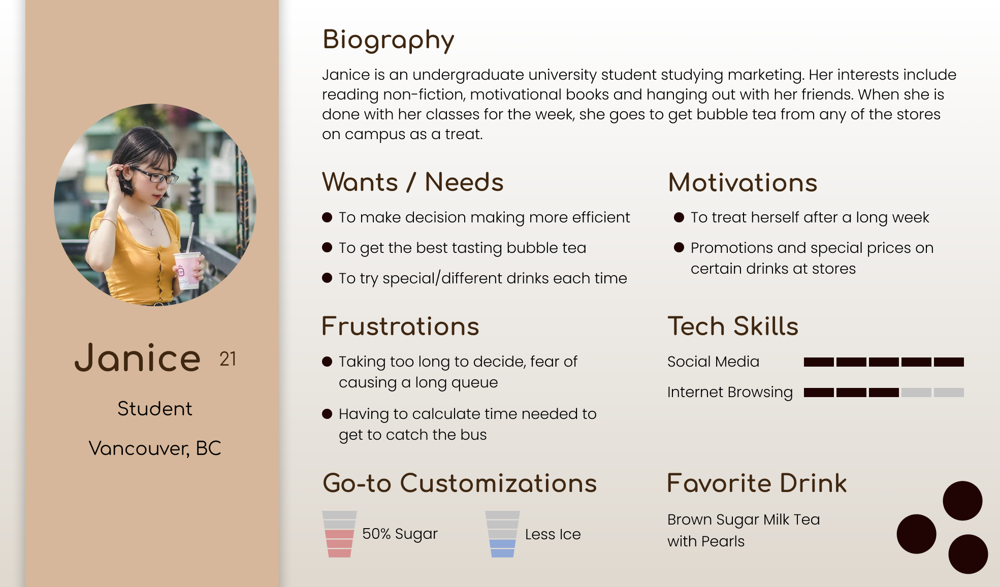
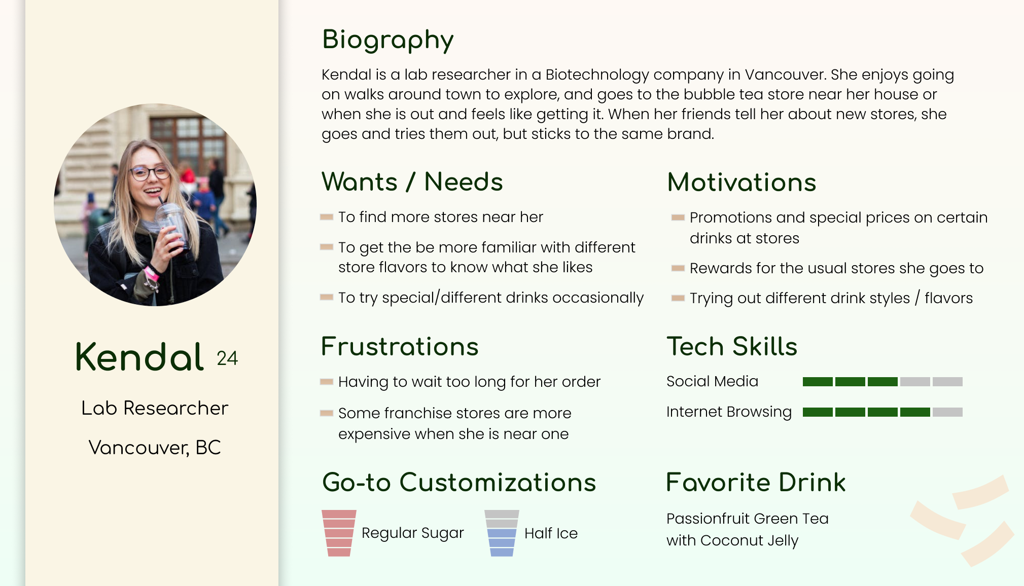
Personas -
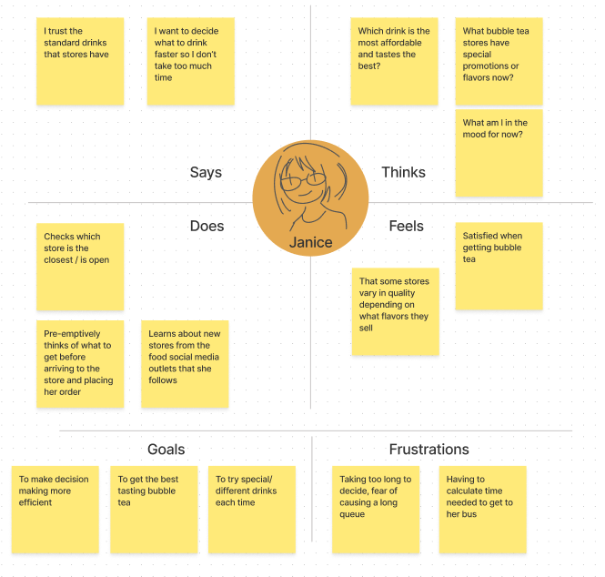
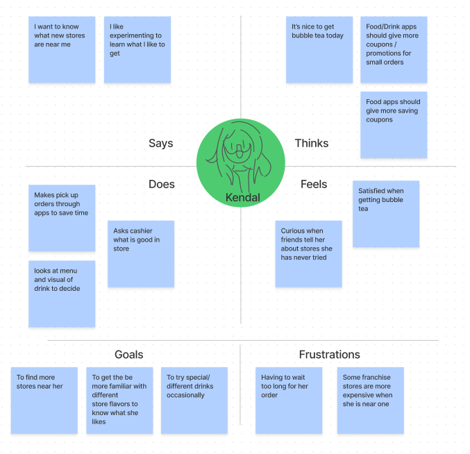
Empathy Map -
Ideation:
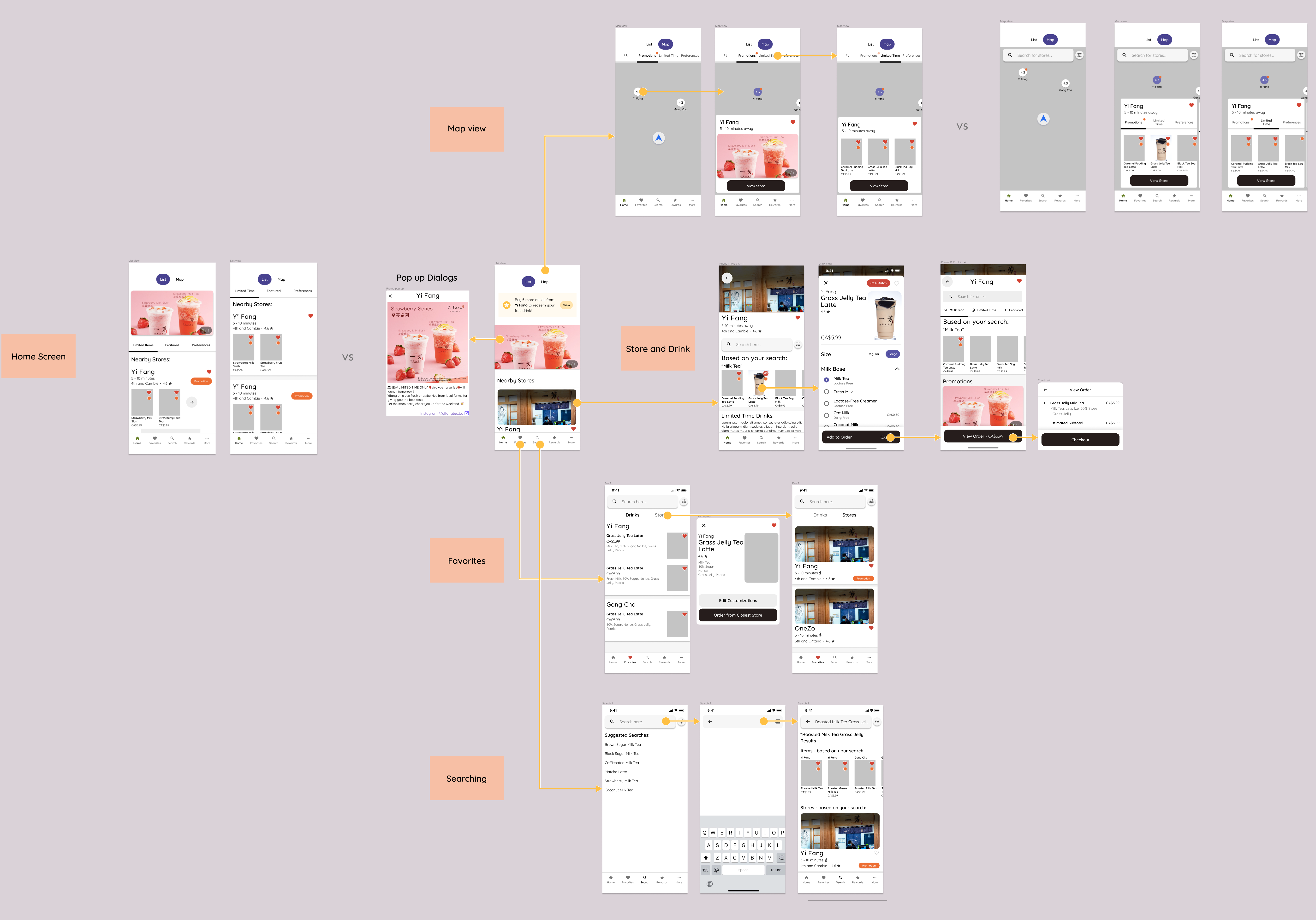
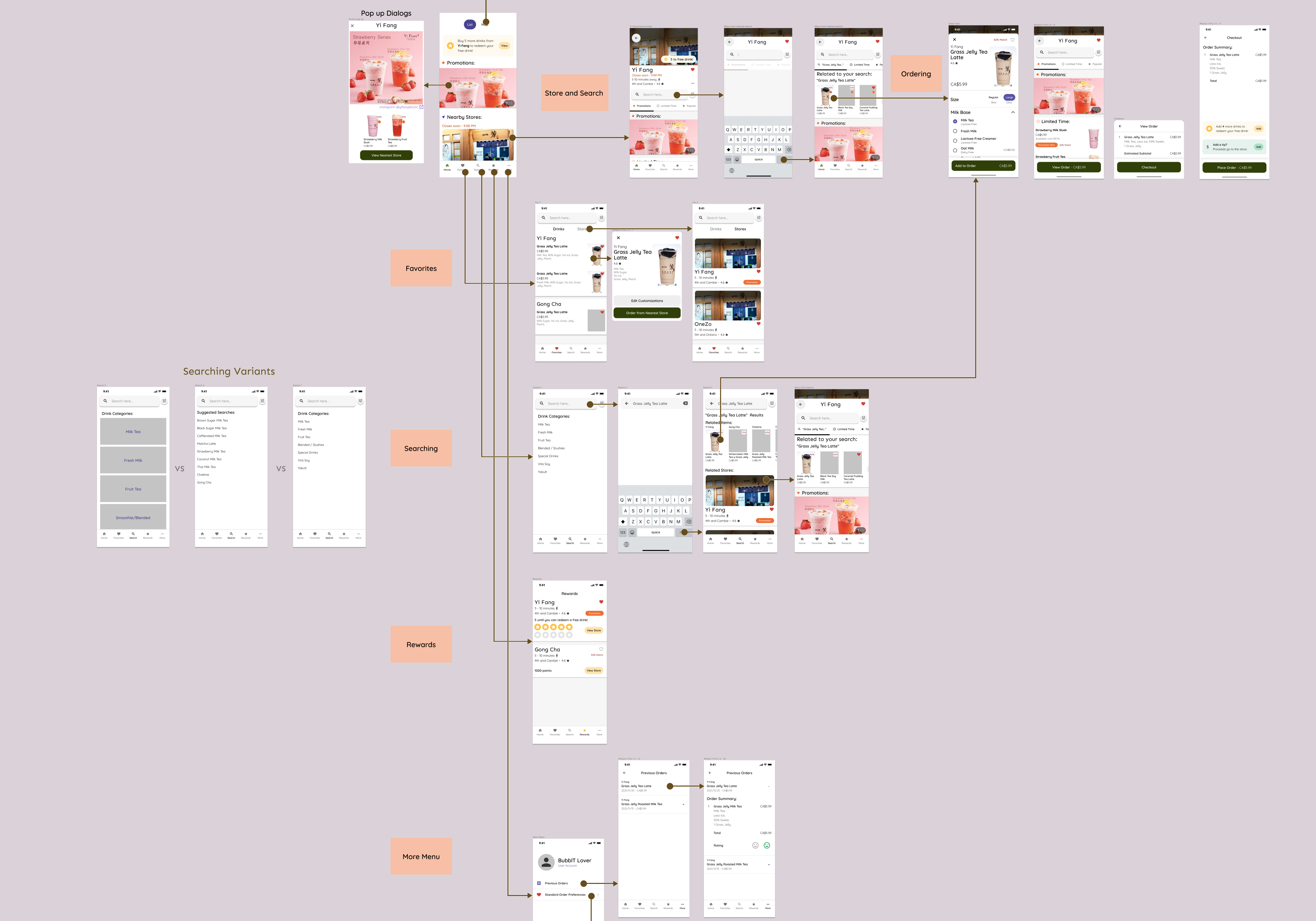
I started by planning how these users would potentially use the application by creating flow diagrams for each planned feature. Many of these flows have changed over the time while I was creating the mockups.
Wireframes -
Glossary / Terms used -
Throughout the designing of the mockups and user testing, I had to define (and redefine) some terms to be able to create a more consistent application. Some terms were borrowed from other applications, but words specific to food or bubble tea were kept the same.
For example:
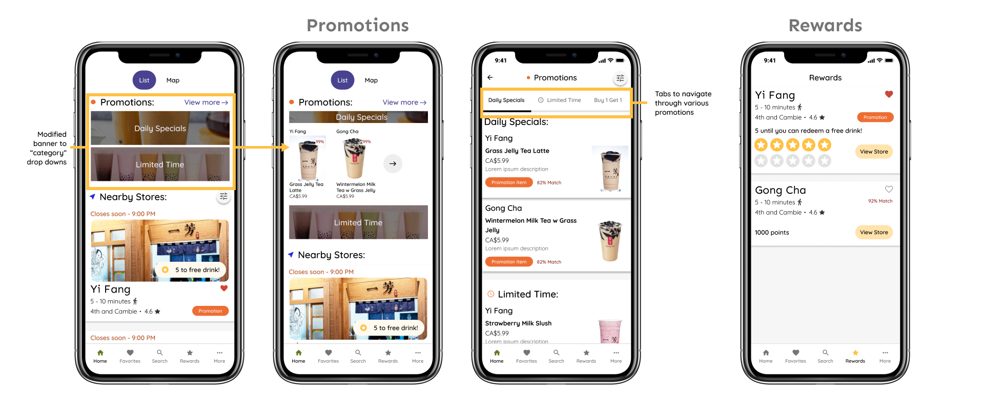
Promotion - Promotional items of any kind (Buy one get one, Limited time items, etc.)
Limited time items - Seasonal items available for a certain period of time.
% Match - Percentage of users potentially liking a product, based on their favourites and previous order experiences.
Mockups, User Testing:
After the wireframes, I made mockups that highlighted the primary features, and to use for user testing to learn how users would interact with the application.
One thing to note, is that the prototypes were done in Figma, which made it somewhat difficult to simulate a real mobile device as test users would interact with it via their computers.
I used Uber's Design System (Base) that was available to the public through Figma, mainly because it had more features and potential that the other design systems did not have.
Mockups (Version 1) -
I had two variations of the home page, one which displayed the list of stores, and another displayed stores as well as drink items that can be selected from the start. I also had two versions of the map page, the first displayed a map with tabs users can select to iterate through each category, and the second which had a search bar, and category tabs only appeared after the user selects a store.
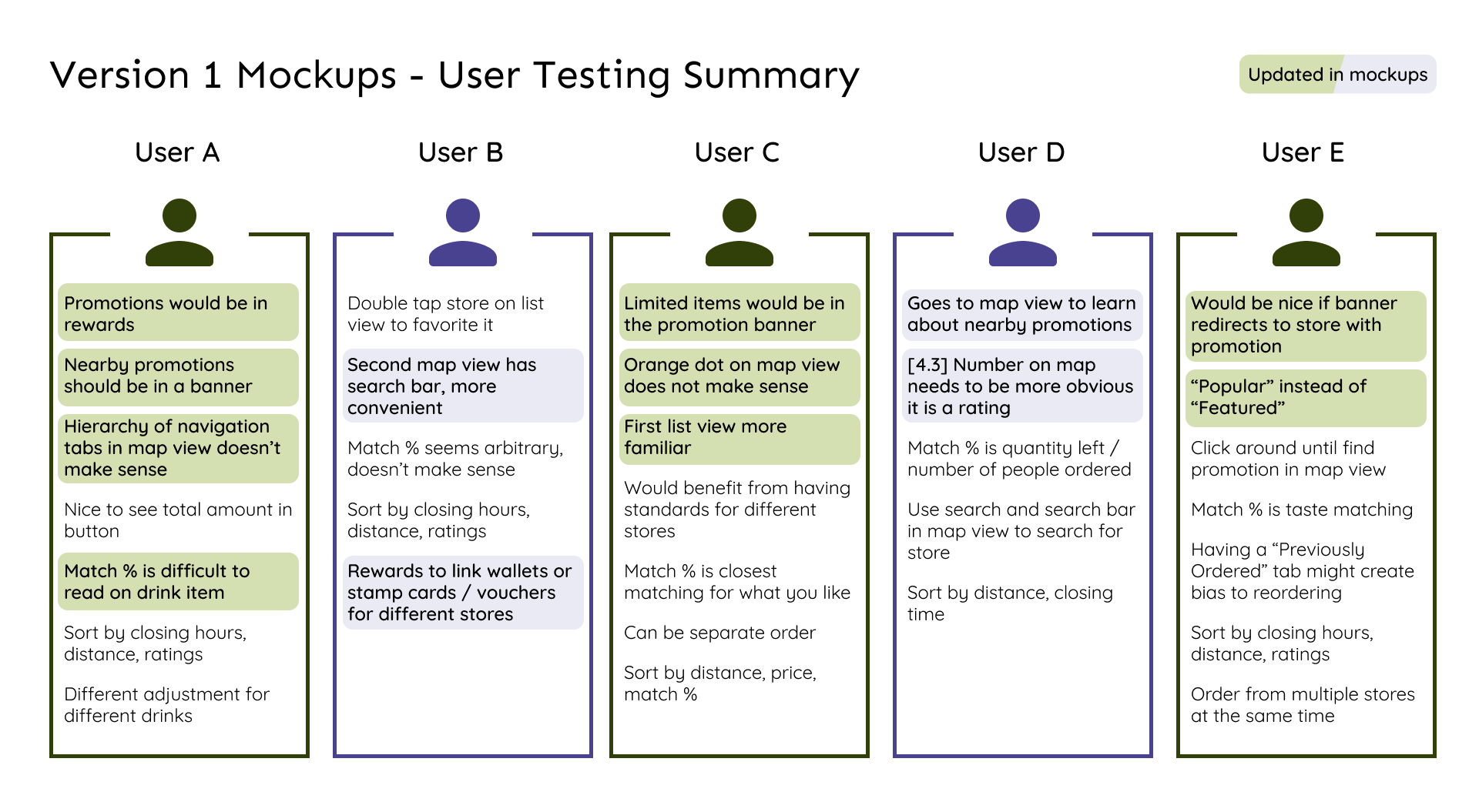
Usability Testing (Round 1) -
The testing was to observe how users would use and if they understood certain features of the application through the prototype. The image below is a summary of the feedback from each user.
Overall, users were concerned with:
- Having more obvious visual for promotions
- Having closing hours displayed for each store
They were also satisfied with:
- Saving customized drinks (Favorites)
- Rewards
Mockups (Version 2) -
Incorporating the feedback I got from the user testing session, I reworked the mockups. I also added a few more new screens.
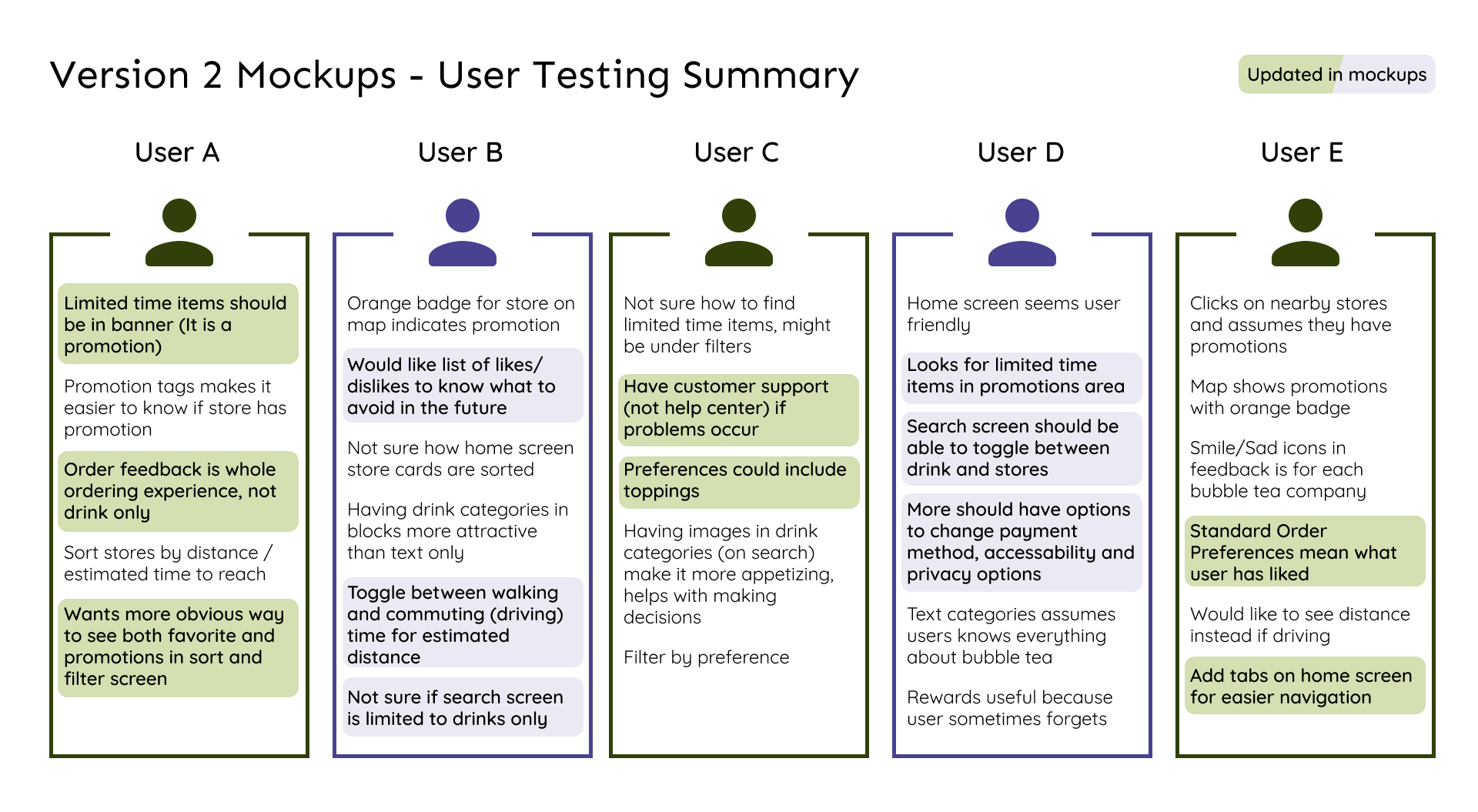
Usability Testing (Round 2) -
This round of testing was to learn if users would understand the main features of the application through the prototype. The image below is a summary of the feedback from each user - different users from the first test round.
Overall, users were concerned with:
- Finding limited time items
- Sorting their searches
They were also satisfied with:
- Searching for drinks (and looking through drink categories)
- Having a map of nearby stores
Prototype:
After the last round of user testing, I got close to enough information of the application's main features and redid the mockups.
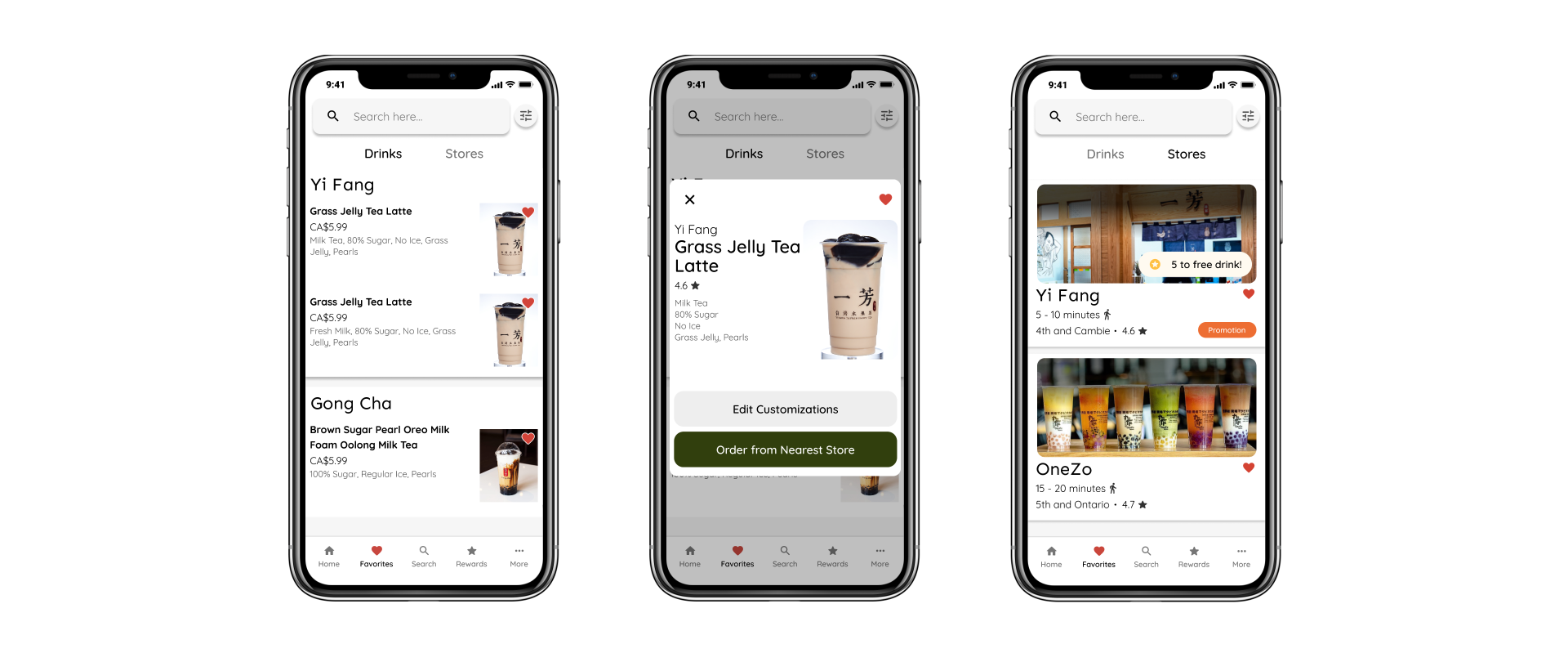
Slide on the images to view between the changes done and the screens itself.
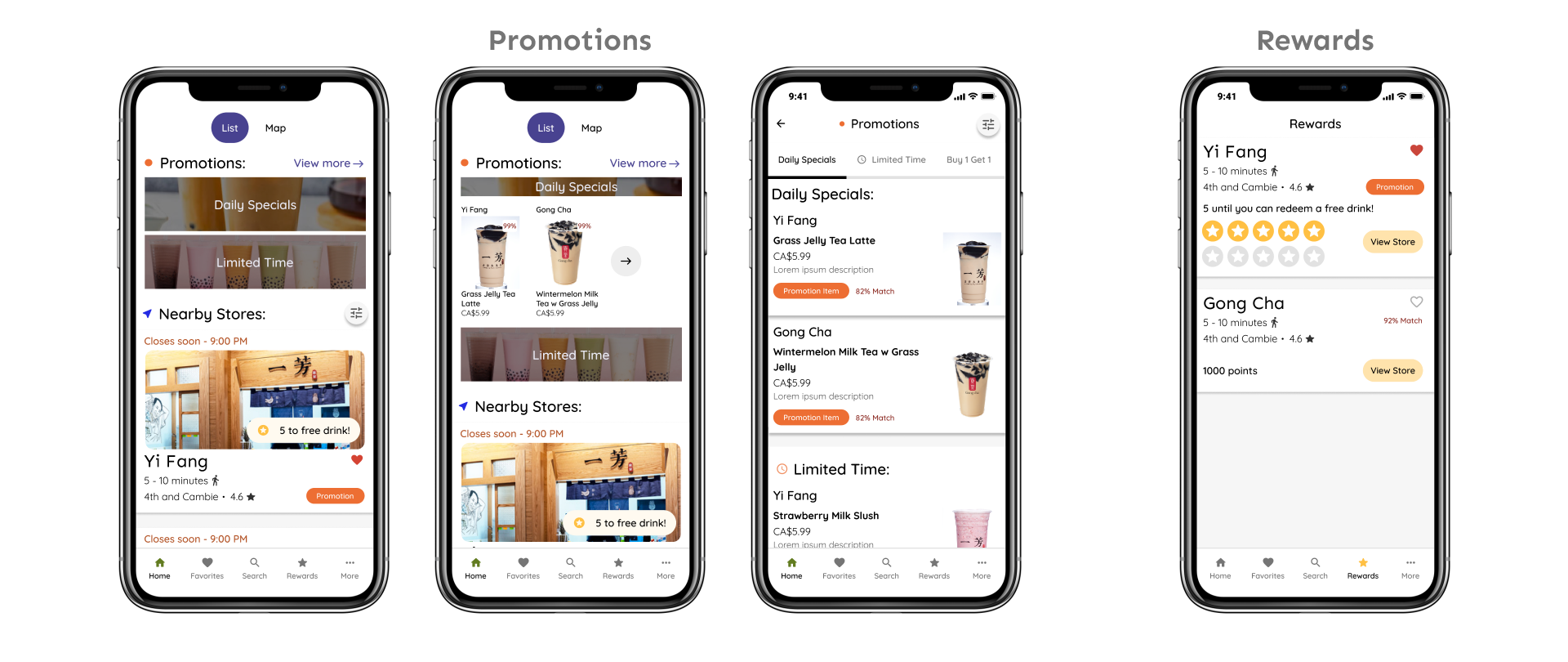
Home Menu, Promotions and Rewards-
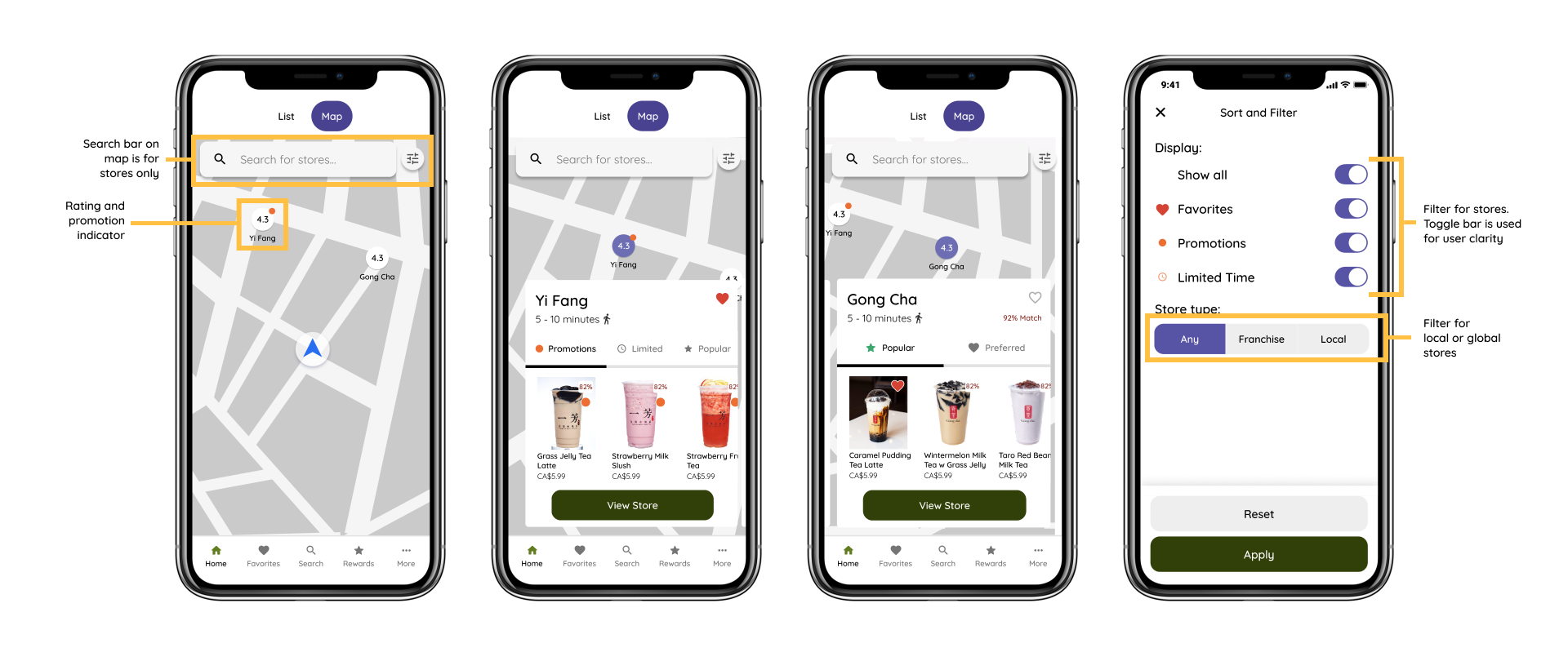
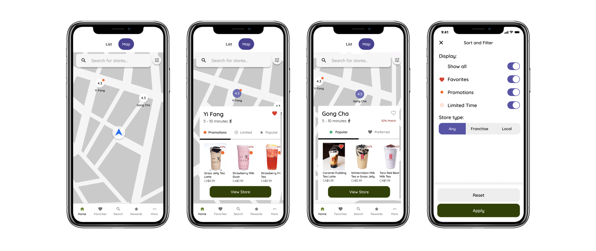
Map view, Sort and Filter -
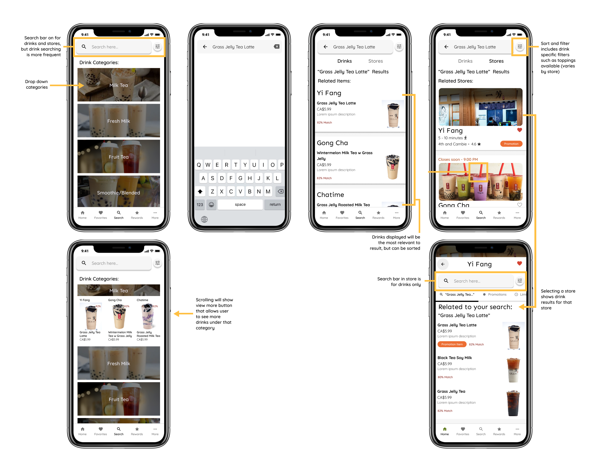
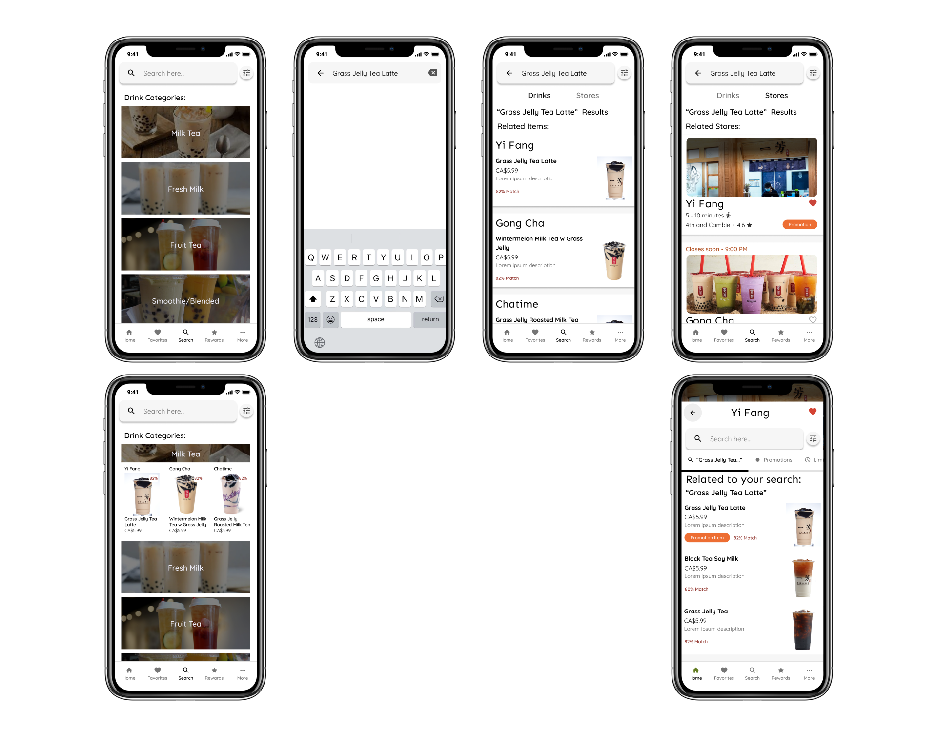
Drink Category, Searching for drinks or stores -
The design the first screen for the search serves somewhat as a drink picker.
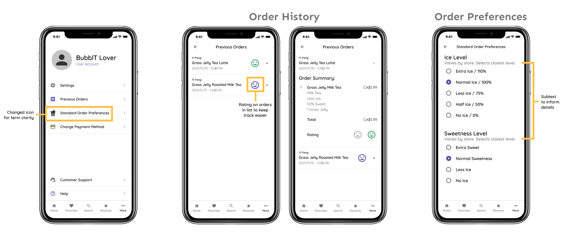
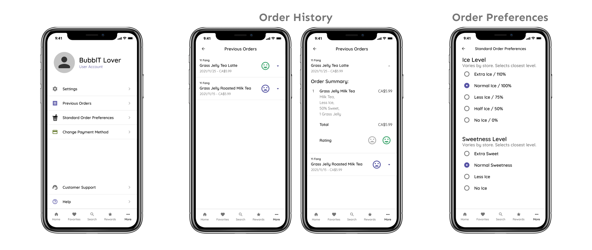
More Menu -
Prototype Video -
Prototype Comments -
I got stuck with a few screens, mainly the sorts and filter screen. Displaying and organizing sorts and filters in general is some what tedious, but after talking to users I was able to cut down the sorts and filters that I need as well as how it should be displayed.
Post-thoughts:
When I started this project I initially wanted the application to be a "Bubble Tea Picker" that gives the user a drink generated from input from the user on their mood and flavors. However, after conducting the user research, I learned that most users would have already decided what they wanted already, so I changed the scope to be a "Bubble Tea Suggest-er" by displaying the preference system for users who want to try new flavours or new stores.
I learned a lot about Figma's variants feature while creating the mockups, which allowed me to create multiple cards with various designs.
In any case, I wish I did more for the user testing stage like taking more notes on what features work better, could be improved or omitted. I do believe I can enhance the application even more through testing.
If possible, it would be interesting to get input from the seller's view, instead of assuming what features they would put up for sale.
